MÜLLER REBRAND
- btatlow95
- Apr 25, 2015
- 1 min read
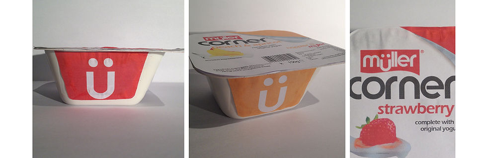
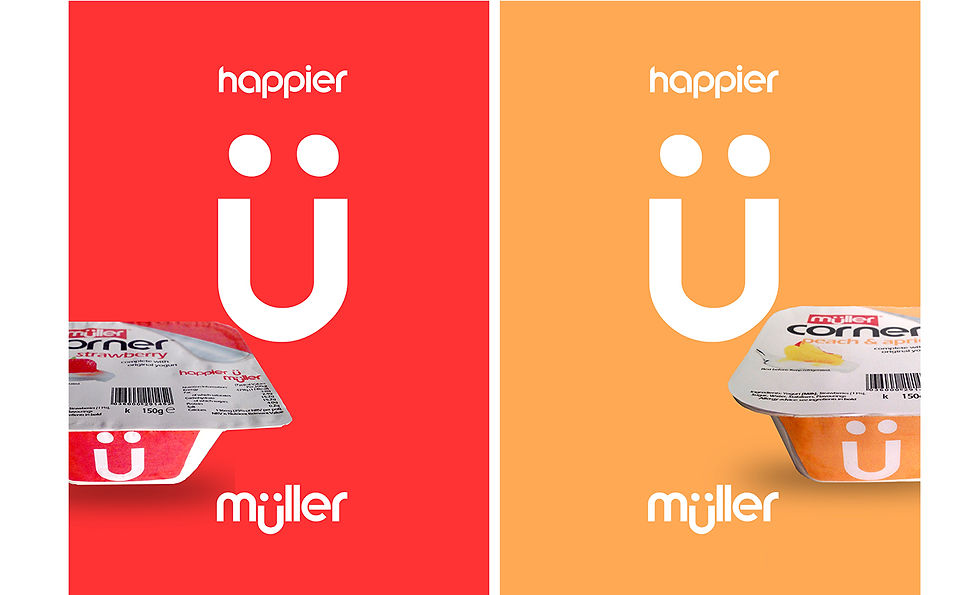
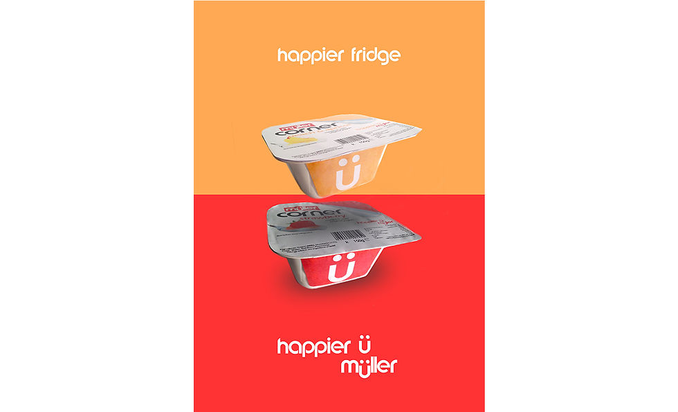
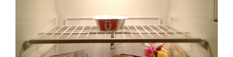
I did a re brand of the well known dairy brand Müller. I played on the use of the umlaut (ü) in the logo and the fact that, to the english market at least, the character looks like a smiley face. This reflected the companies core themes of friendliness and with that in mind I redesigned the logo to look more friendly, repackaged the Corner product and created marketing material.
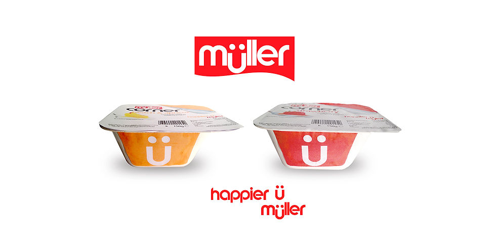
I re designed the Müller logo to make it look more current and also to make it a lot friendlier. Therefore I employed a more rounded font and flat colours. I then repackaged the product to reflect umlaut smile in the logo with the tagline 'happier u. muller'


![JOHN SMEDLEY [WIP]](https://static.wixstatic.com/media/672755_df47ac56884441e0be3656c02384bed7.jpg/v1/fill/w_881,h_500,fp_0.50_0.50,q_30,blur_30,enc_avif,quality_auto/672755_df47ac56884441e0be3656c02384bed7.jpg)
![JOHN SMEDLEY [WIP]](https://static.wixstatic.com/media/672755_df47ac56884441e0be3656c02384bed7.jpg/v1/fill/w_296,h_168,fp_0.50_0.50,q_90,enc_avif,quality_auto/672755_df47ac56884441e0be3656c02384bed7.jpg)


Comments